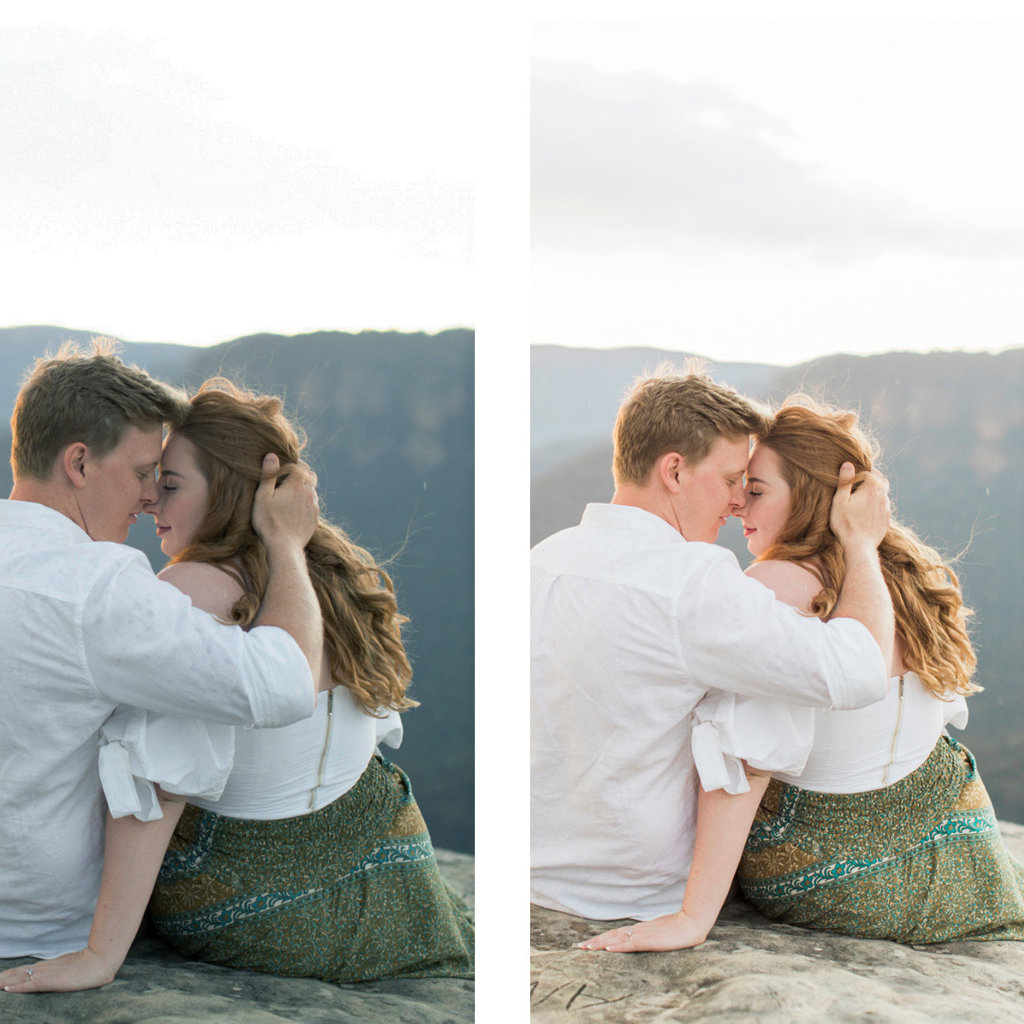
Every accomplished photographer has his or her editing style, something that is a signature to their look that is easily identified. Like Picasso or Van Gogh, you can immediately identify the style of that particular creative artist at a glance.
Just like painters, photographers also have a style they like to emulate. Two of the more popular styles you are to find when sourcing your photographer is ‘Light and Airy’ or ‘Dark and Moody’.
Famous photographers like Annie Leibovitz chooses to use a more muted ‘dark and moody’ style, she keeps the highlight and contrast down, usually using a large single artificial light source for dramatic affect.
Then there is Julie Paisley, whose photography style is ‘light and airy’ emulating the look of film while using natural sunlight as her main source of light.
We, like Julie, love the look of light and airy and we replicate this style in all of our photographs;
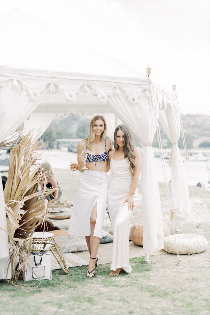
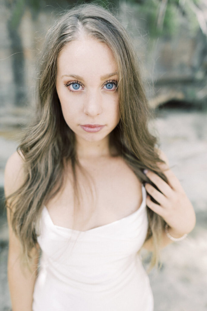
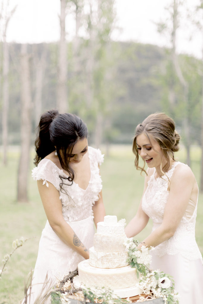
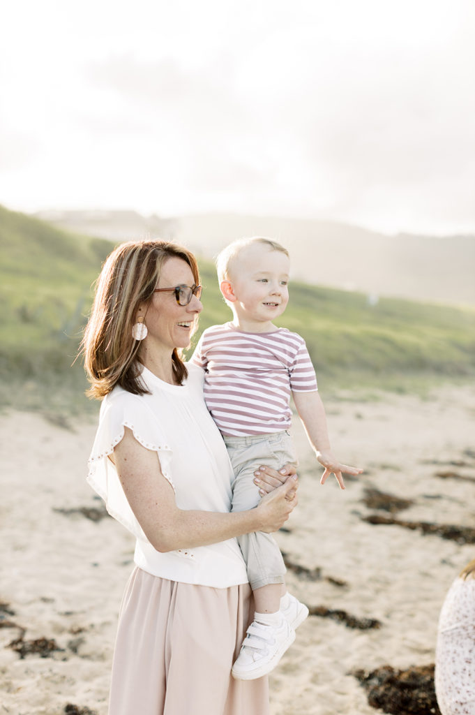
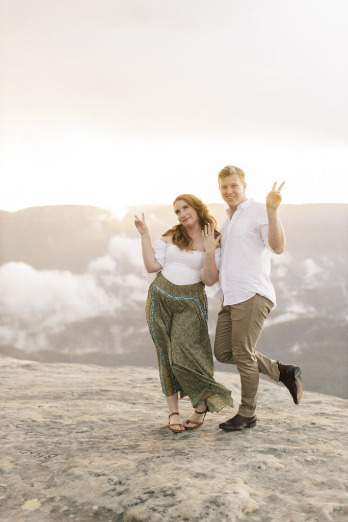
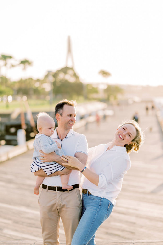
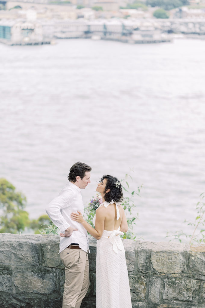
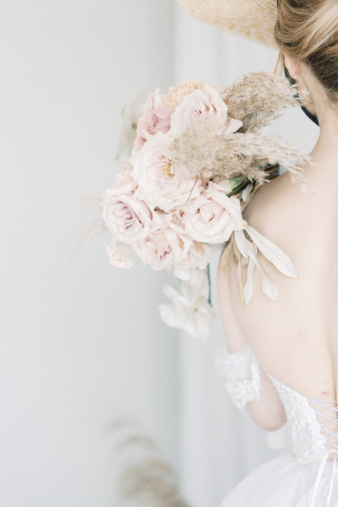
We just love the timeless look we get from film photography, its elegance and opulence is unmatched and suits our photography style perfectly.
Like Julie, we match our film photography with our digital edits. However, unlike her amazing work, our style is a little different when it comes to the editing floor, especially in how we scan our negatives.
To understand this a little better, we are going to need to talk about film.
When shooting weddings, we also shoot with our medium format camera, the Pentax 645n II with the Pentax 67 105mm f/2.4 lens attached.
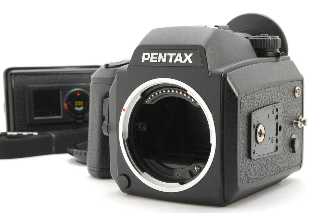
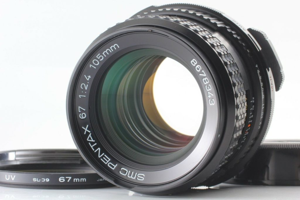
This combo can create amazing photography and in our opinion, still better than what any digital camera can showcase, especially in its ability to produce amazing dynamic range in the highlights and shadows.
Unlike modern digital cameras, the Medium Format 645’s have a much larger sensor, allowing for greater light and a lot more depth of field when shot wide open (that creamy out of focus look you see with DSLR cameras).
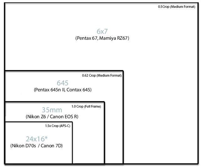
As a result, one of the first ways we emulate film is to shoot with prime lenses. We generally are shooting with 24mm f1.4, 35mm f1.4, 50mm f1.2 and the 85mm f1.8s on our Canon and Nikon digital cameras, remembering that the 105mm lens on the Pentax is equivalent to that of a 65mm lens.
When shooting with these prime lenses, we shoot wide open, meaning we shoot at a lower f/stop. By doing so, the camera will let in more light and allow for those gooey out-of-focus photos we all love.
There are drawbacks to this method to which you will begin to understand the more you use your equipment and the more proficient you become as a photographer.
One of these drawbacks is that shooting wide open (lower f/stop) can produce out of focus subjects if they are not in direct line with your focal point, this can lead to having some people in a group, before and after your focal range, to be shot our of focus, which when photographing a group photo, isn’t ideal.
Another drawback is the amount of contrast that is in your photo, and although yes, Photoshop has the ability to bring back contrast by creating s-curves, or adjusting your black and highlight sliders, it still has trouble bringing back the wrap-around light that can occur shooting wide open, causing your photos to be washed out. This is especially troublesome if the subject is brightly back lit, i.e; a sunset or large bright window when indoors.
And lastly is ‘chromatic aberration’ which lenses can produce. In short, this is the purple/magenta or green fringing you see in the high contrast edges. You can easily replicate this issue by shooting a tree that has the sun behind it, or the shimmer on a lake. Those high contrasts between the subject (leaf) and the light (sun) can cause distracting magenta outlines. Again, this can be cleaned up in Lightroom, but don’t get greedy, you can easily remove it all, but any purple or magenta in the photo will be affected and turn to a grey which looks worse (ever seen a groom with a grey mouth before, eep!)
Newer lenses like the s series from Nikon have come a long way at removing this and do a great job shooting wide open without this drawback, hence the 85mm 1.8s is a go to lens for those high contrasty situations.
TYPES OF FILM
There are several types of film stock you can use when shooting film, each one producing its own unique colouring.
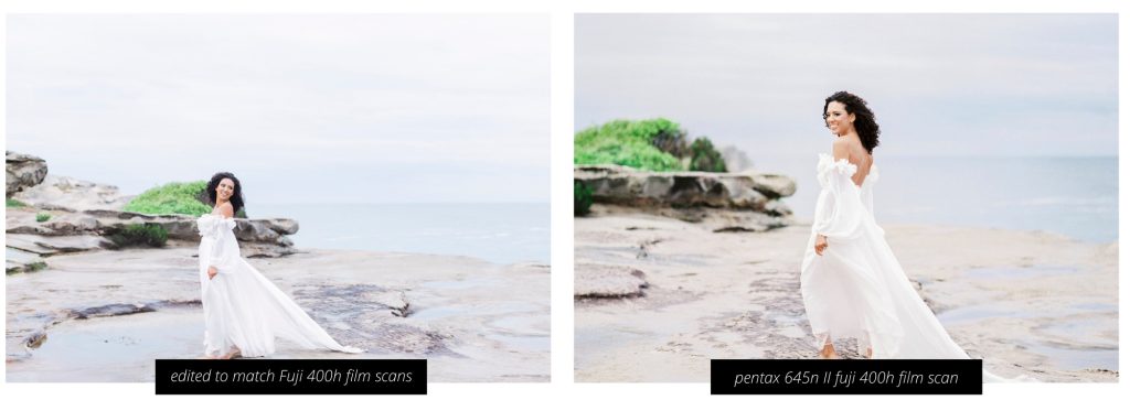
When matching our digital images, we do so to our FUJICOLOR PRO 400H 120 film scans. The colours lean towards a cooler cyan and green base colour that is true to the Fuji 400h Film. One of the reasons we gravitate toward this aesthetic of Fuji 400H in our digital prints is for its pastel (pinky/peachy) skin tones and unique minty colouring of foliage.
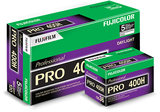
We love the cooler, more neutral tones this produces, especially when processed on the Frontier Scanner. If it’s a cloudy day, we may opt for Pushed +1 or +2 to get a little more colour and contrast into our photos.
TOP FILM STOCKS WE LOVE
Fujifilm Colour Pro 400h (cooler with blues and greens)
Kodak Portra 400 / 800 / 160 (warmer tones)
Kodak Ektar 100 (warmer again and punchier)
Each of the above films produces wildly different colours, Fuji pro 400H (which we primarily only use) has those minty greens and creamy/skin tones, while Kodak Ektar has more saturated golden / warmer tones.
Understanding how each film reacts to light is also important, film stocks like Fuji 400h and Portra 800 are very light hungry and are best to over expose and use in brighter conditions as they can look washed out in cloudy or darker scenes.
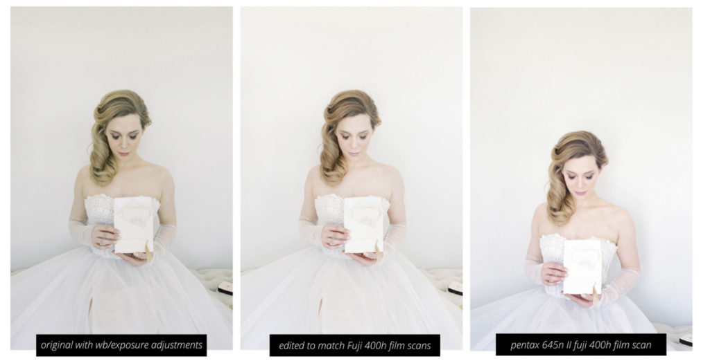
Above is a photoshoot using the canon EOS R (Left) and the Pentax 645n II (right) shot using the Fuji 400h film on a Frontier scanner. As you can see our middle photo is our Photoshop adjustments to best replicate the tones of our film stock which has much more lighter and peachier skin tones.
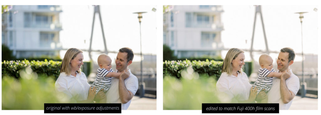
The above is another shoot where we matched our film scan (right) to our digital photo (left) without these adjustments the imagery would look vastly different in the greens, skin tones and overall exposure in the dynamic range of the highlights.
We also don’t always use film when we shoot our clients, but we do have a workflow to adjust our images to still replicate them as if we did indeed take them with our film camera.
Other examples of our editing style can be seen below, you will notice using Fujifilm Pro 400h on the frontier scanner that the greens shift to a more cooler minty colouring instead of the more yellowy warmer tones that we are more used to seeing on digital cameras.
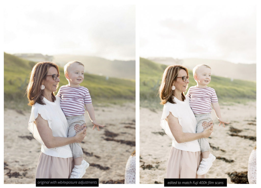
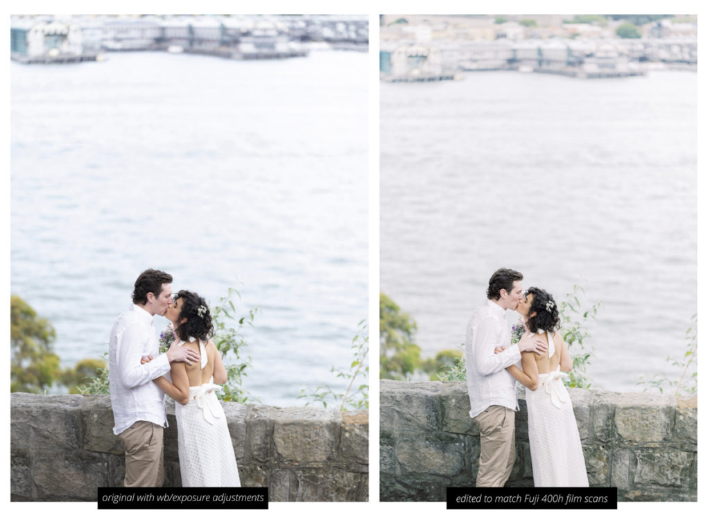
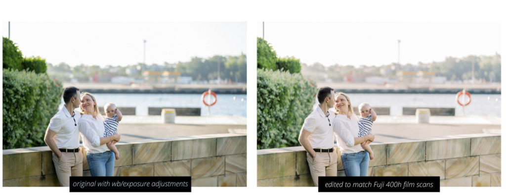
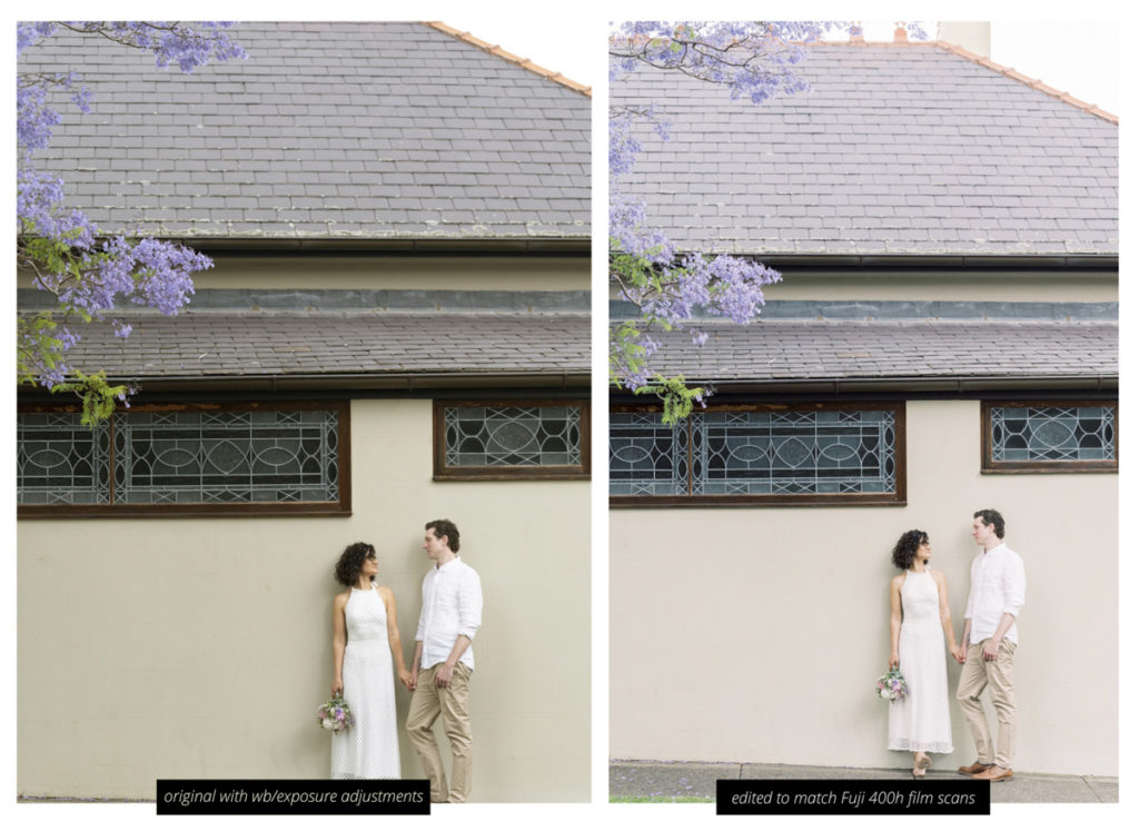
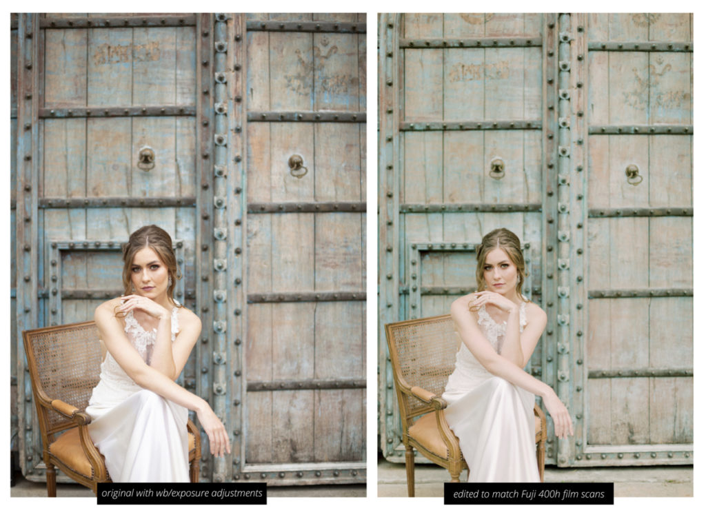
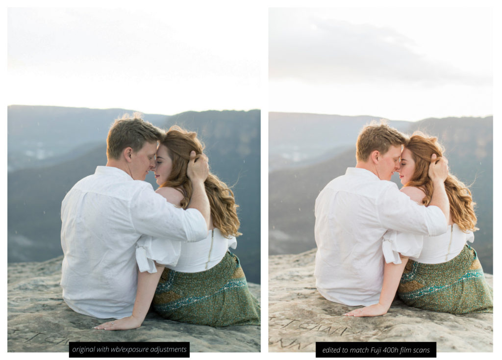
As mentioned the Frontier scanner when processing Fuji 400h film brings out a more cooler, contrasted and minty tone look, however on the other scale you can also use the same Fujicolor film stock scanned on the Noritsu scanner which will produce slightly muted shadow, with pink skin tones, especially in the magenta colour space. Both are fantastic scanners and it really only comes down to personal preference.
When it comes to our studio work, we also match our scans too, again, the yellows are toned down and the greens are mintier while the skin tones are softer and pastel.
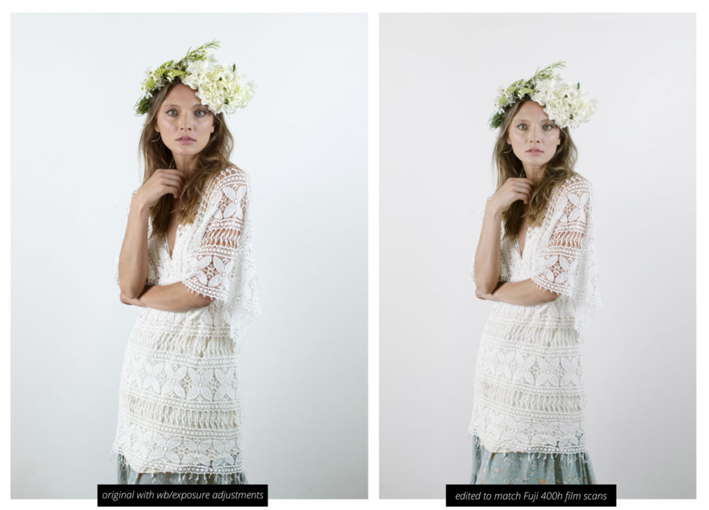
We will talk in more length about how we shoot film in a future blog, however it’s a great way to understand our thought process when we are editing your images for our signature film look.
